4 weeks
UI Designer
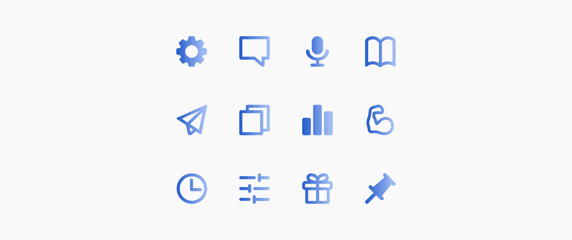
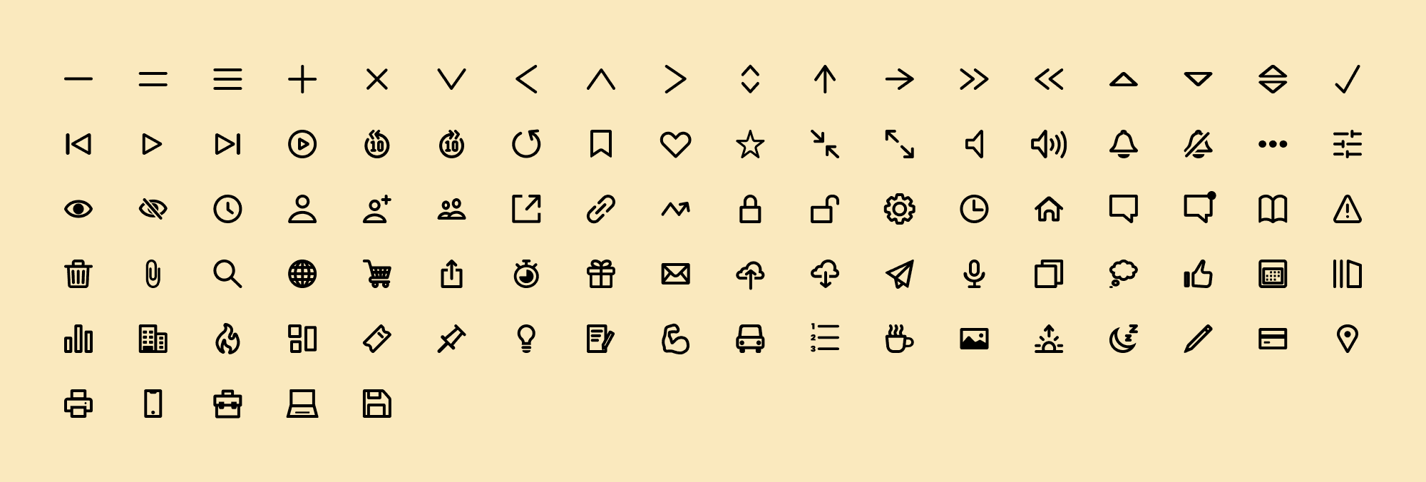
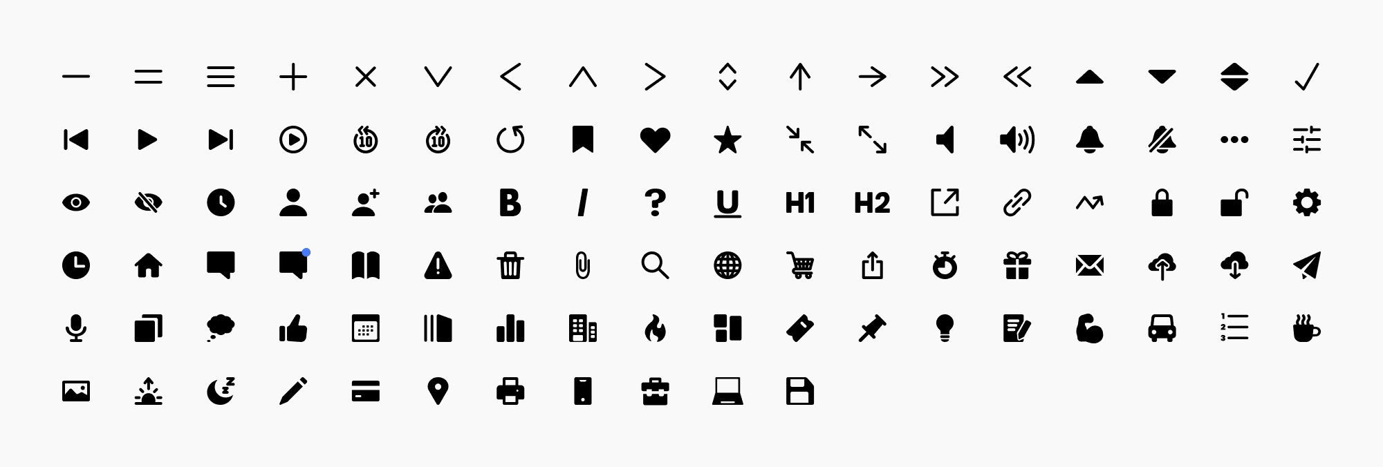
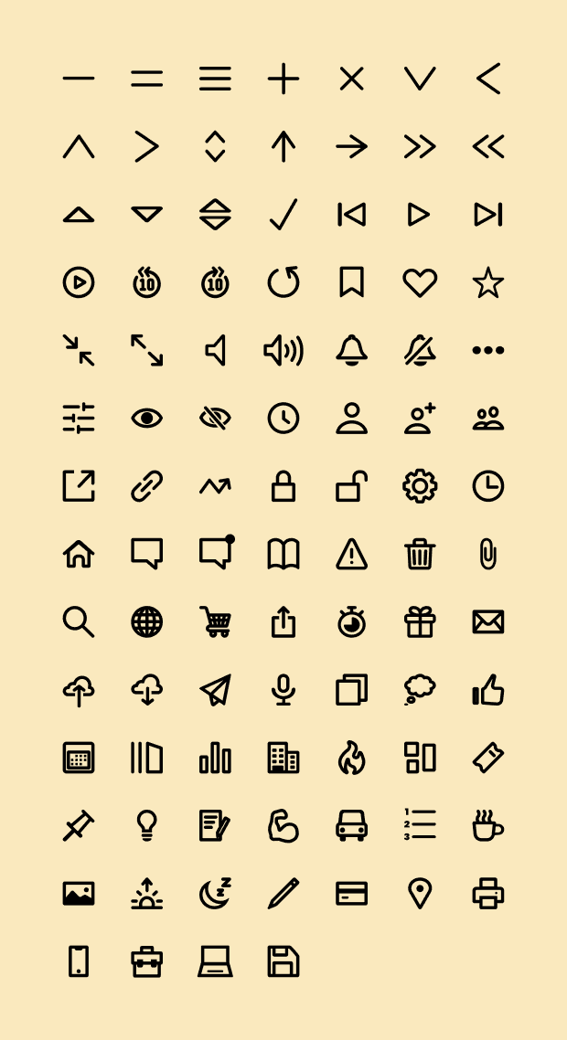
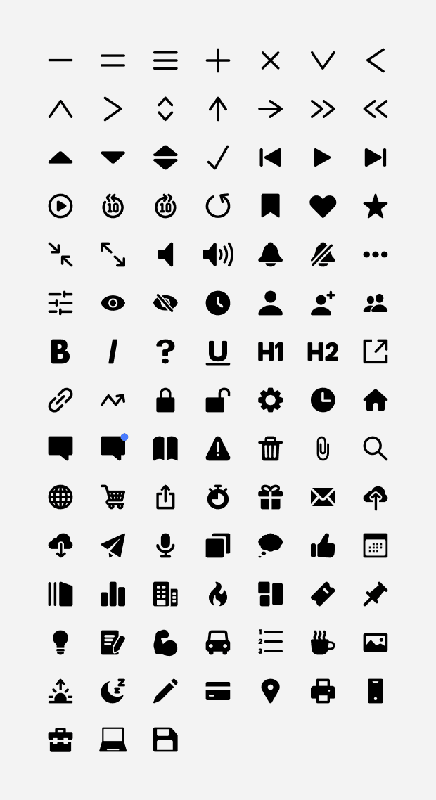
Set of outlined and filled icons for Mojo Crowe’s Design System and icon creation guidelines
Taking steps to prioritise the Mojo App’s UI.
Mojo Crowe is a startup that is dedicated to democratising emotional well-being through its self-development app. Mojo offers a wide array of resources and tools tailored to empower individuals, fostering confidence and enhancing happiness.
As a relatively new startup, good UI was not the highest priority for the company when developing the app and its features. Imagery was sourced from Material UI, but the selected imagery did not share a common visual language. This inconsistency in styles, strokes, ratios, and shapes not only impacted the app's visual appeal and user experience but also weakened the company's brand visual language.
With the growth of the product team, we were finally able to prioritise this issue, and I was given the task of standardising iconography across Mojo.
Poor user experience is hindering the journey of self-development.
Before designing icons for our company's design system, there were a few things I needed to first understand as a Junior Product Designer undertaking their first solo project. Specifically, I needed to grasp two key points:
What is involved in the process of creating icons?
What icons do we already have, what are we currently using, and do we need any specific icons for Mojo?
To answer these questions, I first conducted online research to learn how other designers create icons and the guidelines they follow. With these insights, I brainstormed guidelines I would need to implement in my design process to ensure consistent visual language was achieved.
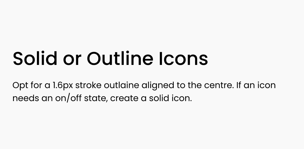
Next, I explored the latest icon trends and styles, aiming to identify the most suitable approach that would best complement the app’s existing branding and UI. After careful consideration, I determined that outlined icons were the most appropriate for Mojo, as this style works well across various design mediums, background colours, and remains easily understandable by users regardless of size.
The next step was to review our existing icon library and identify what was necessary, what wasn’t, and what was desirable. This was done to ensure that time was used efficiently and that only the required or desired icons were designed. During this process, I consulted with the content team, who were deeply involved with the app's content, to determine if any new icons were needed to better communicate specific app content to our users. Upon the completion of this research, I began to design the icons and finalise the guidelines for these designs.
Following a guideline is key to creating pixel-perfect icons.
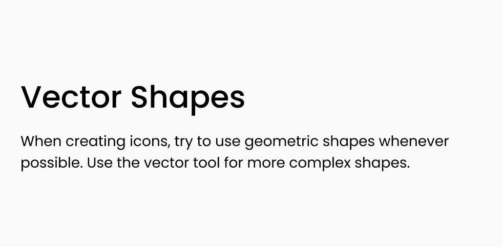
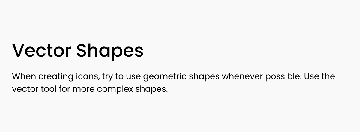
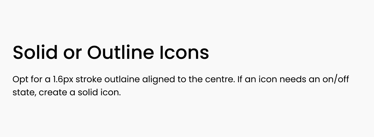
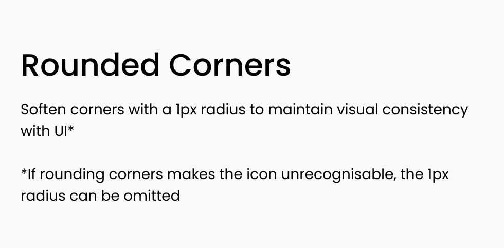
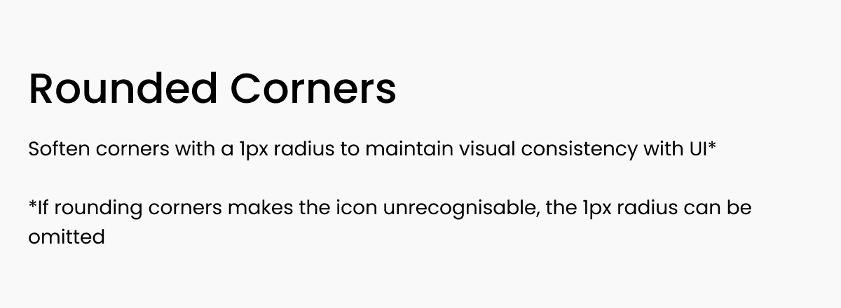
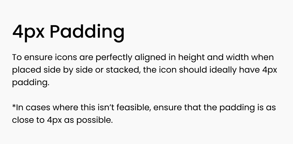
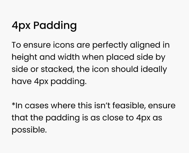
In order to create an icon design system that is consistent in size, stroke, and style while also being recognisable and legible, I established the following guidelines. These clear guidelines ensure that not only can I create a harmonious set of icons, but other designers on the team can also contribute to the design system without introducing any inconsistencies.
Despite these guidelines, I underestimated the complexity of the icon design process, leading me to restart the project three times. It was challenging to maintain consistency in visual weight and size while ensuring legibility. All icons were designed within a 24px frame, as most icons appeared at this size within the app; however, they were created to be scalable, allowing for larger sizes when necessary.
Upon completion, the icons were reviewed by the Head of Product, and revisions were made based on feedback to ensure that all icons carried a similar visual weight. Although this process was tedious, it was essential to achieve pixel-perfect results. The time spent on these details was ultimately rewarding when I saw how the icons I created transformed the app's UI and improved the communication of app content to users.
